Five Number Summary And Box Plot
Muz Play
Mar 21, 2025 · 6 min read
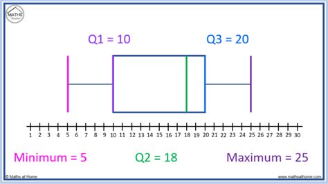
Table of Contents
Five Number Summary and Box Plot: A Comprehensive Guide
Understanding data distribution is crucial in statistics. While measures of central tendency like mean and median offer a snapshot of the data's center, they don't reveal the entire story. This is where the five-number summary and its visual counterpart, the box plot (also known as a box-and-whisker plot), become indispensable tools. They provide a robust overview of data spread, including potential outliers, making them invaluable for exploratory data analysis and effective data visualization.
What is a Five-Number Summary?
The five-number summary is a concise description of a dataset's distribution using five key statistics:
- Minimum: The smallest value in the dataset.
- First Quartile (Q1): The value below which 25% of the data falls. Also known as the 25th percentile.
- Median (Q2): The middle value when the data is ordered. It separates the lower 50% from the upper 50%. Also known as the 50th percentile.
- Third Quartile (Q3): The value below which 75% of the data falls. Also known as the 75th percentile.
- Maximum: The largest value in the dataset.
These five numbers together paint a picture of the data's spread, central tendency, and potential skewness. The difference between Q3 and Q1 is called the interquartile range (IQR), a crucial measure of data dispersion that's resistant to outliers.
Calculating the Five-Number Summary
Calculating the five-number summary involves several steps:
-
Sort the data: Arrange the dataset in ascending order.
-
Find the minimum and maximum: These are the smallest and largest values, respectively.
-
Find the median (Q2): If the dataset has an odd number of values, the median is the middle value. If it has an even number of values, the median is the average of the two middle values.
-
Find the first quartile (Q1): This is the median of the lower half of the data (excluding the median if the dataset has an odd number of values).
-
Find the third quartile (Q3): This is the median of the upper half of the data (excluding the median if the dataset has an odd number of values).
Example:
Let's consider the following dataset: 2, 4, 6, 8, 10, 12, 14
- Minimum: 2
- Q1: 4 (median of 2, 4, 6)
- Median (Q2): 8
- Q3: 12 (median of 10, 12, 14)
- Maximum: 14
This five-number summary indicates a relatively symmetrical distribution.
What is a Box Plot?
A box plot is a graphical representation of the five-number summary. It provides a visual way to understand the data's distribution, including its central tendency, spread, and potential outliers. The box represents the interquartile range (IQR), with the median marked within the box. Lines (whiskers) extend from the box to the minimum and maximum values, showing the overall range.
Components of a Box Plot:
-
Box: The box spans from Q1 to Q3, representing the IQR. The length of the box indicates the spread of the central 50% of the data.
-
Median Line: A vertical line inside the box indicates the median (Q2). The position of the median line within the box can reveal skewness: a median closer to Q1 suggests right skewness, while a median closer to Q3 suggests left skewness.
-
Whiskers: Lines extend from the box to the minimum and maximum values. These whiskers show the full range of the data.
-
Outliers: Data points that fall significantly outside the range of the whiskers are often plotted individually as points. These points are considered potential outliers, deserving further investigation. Common outlier detection methods involve using a multiple of the IQR (e.g., 1.5 * IQR) to define the boundaries beyond which points are flagged as outliers.
Interpreting a Box Plot:
By examining a box plot, you can quickly assess several key features of the data:
-
Central Tendency: The median's position within the box indicates the data's center.
-
Spread: The length of the box (IQR) and the whiskers show the data's spread and variability. A longer box suggests higher variability.
-
Skewness: The position of the median within the box and the relative lengths of the whiskers indicate skewness. A longer whisker on one side indicates potential skewness in that direction.
-
Outliers: Points plotted outside the whiskers are potential outliers, requiring closer examination. They may indicate errors in data collection or represent unusual observations that require further analysis.
Creating a Box Plot:
Box plots can be easily created using various statistical software packages (like R, Python with libraries like Matplotlib or Seaborn) and spreadsheet programs (like Excel or Google Sheets). The process typically involves inputting your data and selecting the box plot option.
Five-Number Summary and Box Plot: Applications and Advantages
The five-number summary and box plots are powerful tools with wide-ranging applications across numerous fields:
-
Exploratory Data Analysis (EDA): They are essential tools for initial data exploration, providing a quick overview of the data's distribution and highlighting potential issues like outliers.
-
Data Comparison: Multiple box plots can be displayed side-by-side to compare the distributions of different groups or datasets. This allows for easy visual comparisons of central tendency, spread, and skewness.
-
Outlier Detection: Box plots visually identify potential outliers, which can then be investigated further to determine if they are errors or genuinely unusual observations.
-
Quality Control: In manufacturing and other quality control settings, box plots are used to monitor process variation and identify potential issues.
-
Financial Analysis: Box plots are useful in visualizing the distribution of returns on investments, assessing risk, and comparing performance across different assets.
Advantages of Using Five-Number Summary and Box Plots:
-
Robustness to Outliers: Unlike the mean, which is highly sensitive to outliers, the median and IQR are resistant to outliers, providing a more reliable description of the data's central tendency and spread.
-
Visual Clarity: Box plots provide a clear and concise visual representation of the data's distribution, making it easy to understand at a glance.
-
Easy Interpretation: The five-number summary and box plots are relatively easy to interpret, even for those without extensive statistical knowledge.
-
Effective Comparison: Multiple box plots enable straightforward comparison of multiple datasets or groups.
-
Identification of Skewness: Box plots readily reveal the skewness of the data, providing insights into the data's symmetry or asymmetry.
Limitations of Five-Number Summary and Box Plots
While powerful, these tools have limitations:
-
Loss of Information: The five-number summary summarizes the data using only five values, potentially losing fine-grained details about the data's distribution.
-
Limited Detail: Box plots might not be appropriate for datasets with highly complex distributions. Histograms or density plots may be more informative in such cases.
-
Subjectivity in Outlier Detection: The definition of an outlier depends on the chosen multiplier of the IQR. Different multipliers might lead to different outlier identifications.
Conclusion
The five-number summary and box plots are invaluable tools for summarizing and visualizing data distributions. Their robustness to outliers, visual clarity, and ease of interpretation make them essential for exploratory data analysis, data comparison, and outlier detection. While they have limitations, they provide a compelling overview of a dataset, offering valuable insights for a wide array of applications. Understanding and utilizing these techniques is a crucial step in gaining deeper insights from data and making informed decisions based on data-driven evidence. By combining the numerical summary with the visual representation, researchers and analysts gain a complete understanding of the data's central tendency, dispersion, and potential outliers, fostering better data interpretation and informed conclusions. Remember to always consider the context of your data and choose the appropriate visualization technique to accurately represent your findings.
Latest Posts
Latest Posts
-
Animal Cell And Plant Cell Similarities
Mar 22, 2025
-
Classify The Characteristics Of Triacylglycerols And Phosphoglycerides
Mar 22, 2025
-
Which Pathway S Compose The Autonomic Nervous System
Mar 22, 2025
-
The Epic Of Gilgamesh Full Text In English
Mar 22, 2025
-
How To Quickly Take The Derivative Of A Complex Number
Mar 22, 2025
Related Post
Thank you for visiting our website which covers about Five Number Summary And Box Plot . We hope the information provided has been useful to you. Feel free to contact us if you have any questions or need further assistance. See you next time and don't miss to bookmark.
