How To Construct A Frequency Table In Excel
Muz Play
Mar 21, 2025 · 6 min read
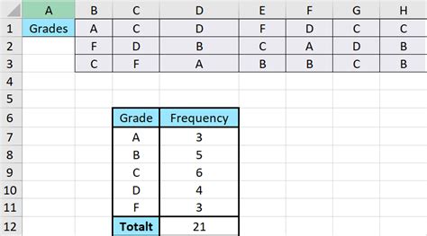
Table of Contents
How to Construct a Frequency Table in Excel: A Comprehensive Guide
Creating a frequency table in Excel is a fundamental data analysis skill. Frequency tables summarize the distribution of categorical or numerical data, showing how often each unique value or range of values occurs. This guide provides a comprehensive walkthrough, covering various methods, from basic manual creation to leveraging Excel's powerful functions for efficiency and advanced analysis. We'll also explore how to customize your frequency tables for better readability and interpretation.
Understanding Frequency Tables
Before diving into the "how-to," let's clarify what a frequency table is and why it's important. A frequency table displays the frequency (count) of each distinct value in a dataset. This helps visualize the data distribution, identify patterns, and make informed decisions based on the data.
For example, imagine you have a dataset of customer ages. A frequency table will neatly summarize how many customers fall within specific age ranges (e.g., 18-25, 26-35, 36-45, etc.), providing a clear overview of the age distribution within your customer base.
Key Components of a Frequency Table:
- Data Value (or Class Interval): This represents the unique value or range of values in your dataset.
- Frequency: This is the number of times each data value or class interval appears in your dataset.
- Relative Frequency: This expresses the frequency as a percentage of the total number of observations. It's calculated as (Frequency / Total Number of Observations) * 100%.
- Cumulative Frequency: This is the running total of frequencies, showing the number of observations up to a specific data value or class interval.
Method 1: Manual Construction of a Frequency Table
This method is ideal for small datasets and helps you understand the underlying principles. Let's assume we have the following dataset representing the number of hours students studied for an exam:
5, 7, 3, 8, 5, 6, 7, 9, 4, 6, 5, 8, 7, 6, 5
-
List Unique Values: First, identify all the unique study hours: 3, 4, 5, 6, 7, 8, 9.
-
Count Frequencies: Manually count how many times each unique value appears in the dataset:
- 3: 1
- 4: 1
- 5: 4
- 6: 3
- 7: 3
- 8: 2
- 9: 1
-
Create the Table: In Excel, create a table with two columns: "Study Hours" and "Frequency." Enter the unique values in the "Study Hours" column and their corresponding frequencies in the "Frequency" column.
-
Calculate Relative and Cumulative Frequency: Add two more columns: "Relative Frequency" and "Cumulative Frequency." Calculate relative frequency using the formula mentioned earlier, and cumulative frequency by summing up the frequencies as you go down the table.
Method 2: Using the COUNTIF Function
For larger datasets, manually counting becomes tedious. Excel's COUNTIF function automates this process. Let's use the same student study hours data.
-
List Unique Values: Again, list the unique study hours (3, 4, 5, 6, 7, 8, 9) in a column (e.g., Column A).
-
Use
COUNTIF: In the adjacent column (e.g., Column B), use theCOUNTIFfunction to count each unique value. The formula in cell B2 would be=COUNTIF($C$1:$C$15,A2), where$C$1:$C$15is the range containing your raw data (replace with your actual data range). Copy this formula down for all unique values. -
Calculate Relative and Cumulative Frequency: Add columns for "Relative Frequency" and "Cumulative Frequency" and calculate them as described in Method 1.
Method 3: Using the FREQUENCY Array Function
For grouped data (data divided into class intervals), the FREQUENCY array function is the most efficient. Let's say we want to group the student study hours into intervals of 2 hours: 0-2, 3-4, 5-6, 7-8, 9-10.
-
Create Bins: In a column (e.g., Column A), list the upper bounds of each class interval: 2, 4, 6, 8, 10.
-
Use
FREQUENCY: Select a range of cells (one cell more than the number of bins) in an adjacent column (e.g., B2:B6). Type the following formula and pressCtrl + Shift + Enter(this is crucial asFREQUENCYis an array function):=FREQUENCY($C$1:$C$15,A2:A6), where$C$1:$C$15is your data range andA2:A6is the range containing the bin upper bounds. -
Calculate Relative and Cumulative Frequency: Add columns for "Relative Frequency" and "Cumulative Frequency" and calculate them as before. Note that the frequency array produced by the
FREQUENCYfunction needs to be handled according to the appropriate intervals.
Method 4: Using Pivot Tables for Advanced Frequency Analysis
Pivot tables are incredibly powerful for creating and manipulating frequency tables, especially for large and complex datasets.
-
Create a Pivot Table: Select your data range, go to the "Insert" tab, and click "PivotTable." Choose where to place the pivot table (new worksheet or existing one).
-
Drag Fields: Drag the data field you want to analyze into the "Rows" area of the PivotTable Fields pane. This will automatically list the unique values.
-
Count Frequencies: Drag the same data field into the "Values" area. By default, it will calculate the sum, but you can click the dropdown arrow on the "Sum of [Your Field Name]" and choose "Value Field Settings." Select "Count" as the summarization method to get the frequencies.
-
Add Calculated Fields: Pivot tables allow you to easily add calculated fields for relative and cumulative frequency.
Customizing Your Frequency Table for Enhanced Readability
Once you have created your frequency table, you can enhance its readability and visual appeal using several techniques:
- Formatting: Apply appropriate formatting (font styles, colors, borders) to make the table visually appealing and easy to read.
- Charting: Create a chart (e.g., bar chart, histogram) based on your frequency table to visually represent the data distribution. Excel makes this easy by allowing direct charting from table data.
- Sorting: Sort the table by frequency, relative frequency, or data values to highlight patterns.
- Adding Titles and Labels: Provide clear and concise titles and labels for your table and chart to ensure they are easily understood.
- Annotations: Add annotations or notes to highlight key findings or interesting observations.
Advanced Frequency Analysis Techniques
Beyond basic frequency counts, Excel allows for more advanced analysis:
- Weighted Frequencies: If certain data points have different weights (e.g., some survey responses carry more significance), you can incorporate weights into your frequency calculations.
- Conditional Frequencies: Calculate frequencies based on specific conditions (e.g., frequency of male customers who purchased a specific product). This can be achieved using the
COUNTIFSfunction (for multiple conditions) or using pivot tables with filters. - Statistical Analysis: Combine frequency tables with other statistical functions (e.g.,
AVERAGE,STDEV) to gain deeper insights into the data distribution.
Conclusion
Creating frequency tables in Excel is a versatile and essential skill for data analysis. From simple manual methods to sophisticated pivot table techniques, Excel provides a range of tools to handle various data types and sizes. Remember to customize your tables for clarity and enhance your understanding of your dataset by combining frequency analysis with other statistical tools. Mastering these techniques will significantly improve your ability to extract meaningful insights from your data.
Latest Posts
Latest Posts
-
Rusting Of Iron Chemical Or Physical Change
Mar 27, 2025
-
How Many Neutrons Does K Have
Mar 27, 2025
-
A Larger Nucleus Splits Apart Making 2 Smaller Ones
Mar 27, 2025
-
What Is A Metaparadigm Of Nursing
Mar 27, 2025
-
Song Lyrics Ode To Billy Joe
Mar 27, 2025
Related Post
Thank you for visiting our website which covers about How To Construct A Frequency Table In Excel . We hope the information provided has been useful to you. Feel free to contact us if you have any questions or need further assistance. See you next time and don't miss to bookmark.
