How To Construct A Standard Curve On Excel
Muz Play
Mar 31, 2025 · 6 min read
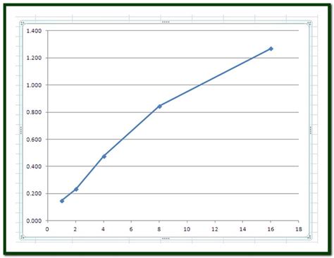
Table of Contents
How to Construct a Standard Curve on Excel: A Comprehensive Guide
Creating a standard curve, also known as a calibration curve, is a fundamental technique in analytical chemistry and many other scientific fields. It's a graphical representation of the relationship between known concentrations of a substance and their corresponding measured signals. This curve allows you to determine the concentration of an unknown sample by measuring its signal and interpolating its concentration from the curve. Excel provides a powerful and accessible tool for constructing and analyzing these curves. This comprehensive guide will walk you through the entire process, from data preparation to interpretation.
Understanding Standard Curves
Before diving into the Excel procedures, let's solidify our understanding of standard curves. The foundation lies in having a set of standards, solutions with precisely known concentrations. These standards are analyzed using a specific method (e.g., spectrophotometry, chromatography), and the resulting signals (e.g., absorbance, peak area) are measured. The goal is to establish a reliable relationship between concentration and signal.
Key Characteristics of a Good Standard Curve:
- Linearity: Ideally, the relationship between concentration and signal is linear, following the equation y = mx + c, where 'y' is the signal, 'x' is the concentration, 'm' is the slope, and 'c' is the y-intercept. Linearity indicates a consistent response across the concentration range.
- Accuracy: The points on the curve should closely reflect the true concentrations of the standards. Inaccurate measurements will lead to an unreliable curve.
- Precision: The measurements for each standard should be reproducible with minimal variation. High precision minimizes error in the interpolation of unknowns.
- Appropriate Range: The concentration range of the standards should encompass the expected concentration of the unknowns. Extrapolation beyond the range of the standard curve is generally discouraged due to increased uncertainty.
Step-by-Step Guide to Creating a Standard Curve in Excel
Let's assume we've already obtained the data for our standards. The data typically consists of two columns: one for the concentration of each standard and the other for its corresponding signal.
1. Data Entry:
First, enter your data into an Excel spreadsheet. Use clear and descriptive column headers (e.g., "Concentration (µg/mL)" and "Absorbance"). Accurate data entry is crucial for a reliable curve. Consider using appropriate units throughout.
| Concentration (µg/mL) | Absorbance |
|---|---|
| 0 | 0.002 |
| 2 | 0.105 |
| 4 | 0.210 |
| 6 | 0.315 |
| 8 | 0.420 |
| 10 | 0.525 |
2. Creating the Scatter Plot:
- Select your data: Highlight both the concentration and absorbance columns.
- Insert Chart: Go to the "Insert" tab and choose "Scatter" chart. Select the first option, which displays individual data points.
- Chart Title and Axis Labels: Add a clear and descriptive title to your chart (e.g., "Standard Curve for Compound X"). Label your x-axis (Concentration) and y-axis (Absorbance) with appropriate units.
3. Adding a Trendline:
- Select a data point on the chart: This will highlight the entire series.
- Add Trendline: Right-click on a data point and choose "Add Trendline."
- Trendline Options: In the "Format Trendline" pane, select "Linear" as the trendline type.
- Display Equation and R-squared: Check the boxes for "Display Equation on chart" and "Display R-squared value on chart." The R-squared value (R²) indicates the goodness of fit of the linear model to the data. An R² value close to 1 indicates a strong linear relationship.
4. Assessing the Quality of the Standard Curve:
The R² value is a crucial indicator of the quality of your standard curve. A high R² value (generally above 0.95) suggests a good fit, implying that the linear model accurately represents the relationship between concentration and signal. However, visual inspection of the plot is also important. Check for:
- Outliers: Data points significantly deviating from the trendline may indicate errors in measurement and should be investigated.
- Non-linearity: If the data points clearly don't follow a straight line, a linear model may not be appropriate. Consider alternative models (e.g., polynomial) or investigating the cause of non-linearity.
5. Using the Standard Curve to Determine Unknown Concentrations:
Once you're satisfied with the quality of your standard curve, you can use it to determine the concentration of unknown samples. Simply measure the signal of your unknown sample using the same method used for the standards. Then, use the equation of the trendline to calculate the concentration:
- Substitute: Substitute the measured signal of the unknown into the 'y' value in the equation.
- Solve for x: Solve the equation for 'x', which represents the concentration.
Example:
Let's say your trendline equation is: y = 0.052x + 0.001. If your unknown sample has an absorbance (y) of 0.3, you would substitute:
0.3 = 0.052x + 0.001
Solving for x gives: x ≈ 5.75 µg/mL. This is the estimated concentration of your unknown sample.
6. Enhancing the Standard Curve:
- Weighted Linear Regression: If the uncertainties in your measurements vary across the concentration range, consider using weighted linear regression. This method assigns greater weight to more precise measurements. Excel doesn't directly support this, but you can perform it using specialized add-ins or statistical software.
- Polynomial Regression: If the data exhibits non-linearity, a polynomial regression may provide a better fit. You can select different polynomial orders (e.g., quadratic, cubic) in the trendline options.
- Error Bars: Adding error bars to your data points visually represents the uncertainty in your measurements. This provides a more realistic representation of the data and its variability. You can add error bars using the "Format Data Series" option in the chart.
Advanced Techniques and Considerations
- Method Validation: Before using a standard curve, it's essential to validate the analytical method used. This involves assessing aspects such as linearity, range, accuracy, precision, limit of detection, and limit of quantification.
- Quality Control Samples: Incorporating quality control (QC) samples – samples with known concentrations – throughout your analysis helps monitor the consistency and reliability of your measurements.
- Blank Correction: Subtracting the signal of a blank (a sample without the analyte) from all measurements helps correct for background noise and interference.
- Data Transformation: Sometimes, data transformation (e.g., logarithmic transformation) can improve linearity.
- Outlier Treatment: While outliers should be investigated, you might choose to remove them if they're demonstrably due to experimental error. However, justify your decision clearly.
Conclusion
Constructing a standard curve in Excel is a straightforward yet powerful technique for quantitative analysis. By following these steps and considering the advanced techniques, you can create reliable and informative standard curves to accurately determine the concentrations of unknown samples in your research or experiments. Remember to always critically assess your data, understand the limitations of your analysis, and strive for clarity and accuracy in your reporting. The quality of your standard curve directly impacts the reliability of your results, so meticulous attention to detail throughout the process is vital.
Latest Posts
Latest Posts
-
Gramatica A The Verb Tener Answers
Apr 02, 2025
-
Are There Lysosomes In A Plant Cell
Apr 02, 2025
-
Root System And Shoot System Of Plants
Apr 02, 2025
-
Ecological Diversity Is A Measure Of The Number Of
Apr 02, 2025
-
Plant Cell In A Isotonic Solution
Apr 02, 2025
Related Post
Thank you for visiting our website which covers about How To Construct A Standard Curve On Excel . We hope the information provided has been useful to you. Feel free to contact us if you have any questions or need further assistance. See you next time and don't miss to bookmark.
