How To Make A Standard Curve In Excel
Muz Play
Mar 23, 2025 · 6 min read
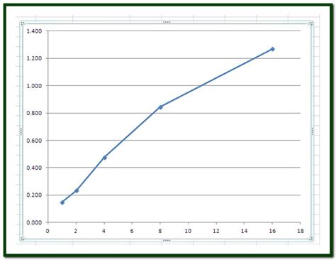
Table of Contents
How to Make a Standard Curve in Excel: A Comprehensive Guide
Creating a standard curve, also known as a calibration curve, is a fundamental technique in analytical chemistry and many other scientific fields. It allows you to determine the concentration of an unknown sample by comparing its response to a set of known concentrations. While specialized software exists, Excel provides a powerful and readily accessible tool for creating and analyzing these curves. This guide will walk you through the entire process, from data preparation to interpreting your results, empowering you to confidently generate accurate and reliable standard curves.
Understanding Standard Curves
Before diving into the Excel process, let's clarify the core concept. A standard curve relies on the principle of linearity between the concentration of a substance and its measurable response (e.g., absorbance, fluorescence intensity, peak area in chromatography). You prepare a series of solutions with known concentrations, measure their responses, and plot these data points on a graph. The resulting curve allows you to interpolate the concentration of an unknown sample based on its measured response.
Key Components of a Standard Curve:
- Standards: Solutions with precisely known concentrations of the analyte (the substance you're measuring).
- Measurements: Quantitative data obtained from analyzing the standards using an appropriate instrument (spectrophotometer, fluorometer, etc.).
- Calibration Curve: A graph plotting the measured response (y-axis) against the corresponding concentrations (x-axis).
- Equation of the Line: The linear equation (y = mx + c) derived from the best-fit line through the data points. This equation is crucial for determining unknown concentrations.
- R² Value (Coefficient of Determination): A statistical measure indicating the goodness of fit of the linear regression. An R² value close to 1 indicates a strong linear relationship, suggesting high reliability.
Preparing Your Data in Excel
Accurate data entry is paramount for a reliable standard curve. Here's a step-by-step guide to organizing your data in Excel:
1. Setting up Your Worksheet:
Create a new Excel worksheet. In the first column (usually column A), label the first cell as "Concentration" (or a similar descriptive label). In the second column (column B), label the first cell as "Response" (e.g., "Absorbance," "Fluorescence," "Peak Area").
2. Entering Your Data:
- Concentrations: Enter the known concentrations of your standards in column A, starting from the lowest concentration to the highest. Ensure the units are clearly indicated (e.g., µg/mL, mg/L, mM).
- Responses: Enter the corresponding measured responses for each standard in column B. Again, ensure the units are clearly stated (e.g., absorbance units, arbitrary fluorescence units).
Example Data:
| Concentration (µg/mL) | Response (Absorbance) |
|---|---|
| 0 | 0.01 |
| 2 | 0.12 |
| 4 | 0.25 |
| 6 | 0.37 |
| 8 | 0.50 |
| 10 | 0.62 |
Creating the Standard Curve in Excel
Now that your data is organized, let's create the standard curve:
1. Select Your Data: Highlight the cells containing both your concentration and response data (including the headers).
2. Insert a Scatter Plot: Go to the "Insert" tab and select a scatter plot (usually the first option, showing just points without lines). This type of chart is best for visualizing the relationship between two variables.
3. Add a Trendline:
- Right-click on any data point in the chart.
- Select "Add Trendline."
- In the "Format Trendline" pane, choose "Linear" as the trendline type.
- Crucially, check the boxes for "Display Equation on chart" and "Display R-squared value on chart." This will show the equation of the best-fit line and the R² value directly on the graph.
4. Customize Your Chart:
- Add a descriptive title (e.g., "Standard Curve for [Analyte Name]").
- Label the x-axis ("Concentration [Units]") and the y-axis ("Response [Units]").
- Adjust the chart's appearance for clarity (font sizes, colors, etc.).
Interpreting Your Results
The equation displayed on the chart (typically in the form y = mx + c) is essential for determining unknown concentrations. 'm' represents the slope, and 'c' represents the y-intercept. To find the concentration of an unknown sample:
- Measure the response of the unknown sample using the same method used for the standards.
- Substitute the measured response value into the equation for 'y'.
- Solve the equation for 'x', which represents the concentration of the unknown sample.
Example:
Let's say the equation of your standard curve is y = 0.06x + 0.01, and the unknown sample has a response of 0.40.
0.40 = 0.06x + 0.01 0.39 = 0.06x x = 6.5 µg/mL
Therefore, the estimated concentration of the unknown sample is 6.5 µg/mL.
Assessing the R² Value:
The R² value (coefficient of determination) indicates the goodness of fit of the linear regression. A value close to 1 (e.g., 0.99 or higher) suggests a strong linear relationship between concentration and response, indicating a reliable standard curve. A lower R² value indicates a weaker relationship, potentially due to experimental error or non-linearity in the data. If your R² value is significantly low, you might need to investigate potential sources of error or consider a different type of curve fitting (e.g., polynomial).
Advanced Techniques and Considerations
1. Handling Outliers: If a data point deviates significantly from the overall trend, consider removing it after careful investigation to improve the accuracy of your curve. However, always justify the removal of data points in your report.
2. Weighting: In certain scenarios, you might need to assign different weights to your data points based on their uncertainties. Excel's regression analysis allows for weighted least-squares regression, which can improve accuracy when dealing with uneven uncertainties.
3. Non-linear Standard Curves: Not all relationships between concentration and response are linear. In such cases, you may need to use non-linear regression techniques (available in Excel through add-ins or other statistical software) to fit a more appropriate curve (e.g., logarithmic, exponential, sigmoidal).
4. Blanks and Controls: Always include blanks (samples without the analyte) and appropriate controls in your experiments to account for background noise and other potential interferences.
Best Practices for Accurate Standard Curves
- Appropriate Range: Select a concentration range that spans the expected concentration of your unknown samples while ensuring linearity.
- Multiple Measurements: Take multiple measurements for each standard to improve the accuracy and reliability of your results. Calculate the average response for each concentration.
- Proper Calibration: Ensure your instrument is properly calibrated before conducting measurements.
- Error Analysis: Consider performing error analysis to assess the uncertainty in your measurements and the resulting concentration calculations.
- Documentation: Keep detailed records of your experimental procedures, including all relevant parameters and observations.
Conclusion
Creating a standard curve in Excel is a straightforward yet powerful technique for determining the concentration of unknown samples. By carefully preparing your data, selecting the appropriate chart type, and understanding the interpretation of the resulting equation and R² value, you can generate accurate and reliable results for a wide range of scientific applications. Remember to always critically evaluate your data and consider advanced techniques when necessary to ensure the robustness and accuracy of your analysis. This comprehensive guide empowers you to confidently leverage Excel's capabilities for your analytical needs, enhancing your experimental workflow and data analysis.
Latest Posts
Latest Posts
-
General Chemistry Principles And Modern Applications By Petrucci
Mar 25, 2025
-
Environmental Factors That Influence Microbial Growth
Mar 25, 2025
-
Electrons In An Atoms Outermost Energy Shells Are Called
Mar 25, 2025
-
Which Kingdoms Contain Organisms That Are Prokaryotes
Mar 25, 2025
-
What Element Is Found In Proteins
Mar 25, 2025
Related Post
Thank you for visiting our website which covers about How To Make A Standard Curve In Excel . We hope the information provided has been useful to you. Feel free to contact us if you have any questions or need further assistance. See you next time and don't miss to bookmark.
