Where Does The Dependent Variable Go On A Graph
Muz Play
Mar 16, 2025 · 6 min read
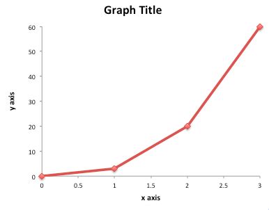
Table of Contents
Where Does the Dependent Variable Go on a Graph? A Comprehensive Guide
Understanding where to place the dependent variable on a graph is fundamental to effectively communicating scientific findings, statistical analyses, and general data visualizations. This seemingly simple question underpins the entire process of data representation and interpretation. This comprehensive guide will delve deep into this crucial aspect of graphing, covering various graph types, common misconceptions, and best practices to ensure your visualizations are accurate, clear, and impactful.
Understanding Independent and Dependent Variables
Before we tackle the placement of the dependent variable, let's solidify our understanding of what these variables are. In any experiment or observational study, we're interested in the relationship between different factors.
-
Independent Variable (IV): This is the variable that is manipulated or controlled by the researcher. It's the factor that's believed to influence or cause a change in another variable. Think of it as the cause. For example, in a study investigating the effect of fertilizer on plant growth, the amount of fertilizer used would be the independent variable.
-
Dependent Variable (DV): This is the variable that is measured or observed. It's the factor that is affected or influenced by the independent variable. It's the effect or the outcome of the experiment. In our plant growth example, the height of the plants would be the dependent variable.
Key Distinction: The independent variable is what you change, while the dependent variable is what you measure as a result of that change. This distinction is paramount in determining their placement on a graph.
Graphing Conventions: The Standard Approach
The standard convention in graphing is to plot the independent variable on the horizontal (x-axis) and the dependent variable on the vertical (y-axis). This arrangement reflects the causal relationship: the independent variable (cause) influences the dependent variable (effect). This visual representation immediately communicates the direction of the relationship being studied.
This convention is universal across most graph types, including:
-
Line graphs: Ideal for showing trends over time or continuous data. The independent variable (often time) is on the x-axis, and the dependent variable is on the y-axis. For instance, tracking the growth of a plant over several weeks.
-
Scatter plots: Used to show the relationship between two variables, often exploring correlation. The independent variable is on the x-axis, and the dependent variable is on the y-axis. Each point on the graph represents a single data point. For example, correlating hours of study with exam scores.
-
Bar graphs: Effective for comparing different categories or groups. While not strictly dependent/independent in the same way as line or scatter plots, the categorical variable being compared (often considered analogous to the independent variable) usually goes on the x-axis, and the measured outcome (dependent variable) on the y-axis. For instance, comparing the average height of plants treated with different fertilizers.
-
Histograms: Used to show the distribution of a single variable. While histograms don't have a clear independent variable, the variable being measured is plotted on the x-axis, and the frequency or count of each value is plotted on the y-axis.
Why This Convention Matters
The consistent placement of variables is critical for several reasons:
-
Clarity and Interpretability: It ensures that anyone viewing the graph can instantly understand the relationship between the variables. The visual arrangement mirrors the underlying scientific logic.
-
Facilitates Analysis: The structured approach makes it easier to identify trends, patterns, and relationships between the data points. It simplifies the process of drawing conclusions from the visualized data.
-
Standardization: Adherence to this convention promotes consistency across different graphs and studies, ensuring easier comparison and understanding between different research projects.
-
Avoids Misinterpretation: Plotting the variables incorrectly could lead to misleading interpretations and inaccurate conclusions.
Common Mistakes and Misinterpretations
Several common mistakes can lead to misinterpretations when plotting dependent and independent variables:
-
Reversal of Axes: The most frequent error is simply swapping the axes, placing the dependent variable on the x-axis and the independent variable on the y-axis. This immediately inverts the implied causal relationship, leading to a completely wrong interpretation.
-
Ignoring Causality: Sometimes, the relationship between variables isn't strictly causal. Correlation does not imply causation. While you might still plot the variables on the x and y axes, it's crucial to acknowledge that the plotted relationship may not reflect a direct cause-and-effect link.
-
Poor Axis Labeling: Failing to clearly label the axes, including units of measurement, can make it impossible for others to understand the data being presented. Always clearly label both axes with descriptive labels and units.
-
Inappropriate Graph Type: Choosing the wrong type of graph for the data can also affect interpretability. Using a line graph for categorical data, for example, would be misleading.
Advanced Considerations: More Complex Scenarios
While the basic convention is straightforward, some scenarios require a more nuanced approach:
-
Multiple Independent Variables: In experiments with more than one independent variable, you might use different graphs to visualize each relationship individually or employ more complex techniques like 3D graphs or interaction plots.
-
Multiple Dependent Variables: Similarly, studies with multiple dependent variables will necessitate multiple graphs or more complex visualization strategies.
-
Control Variables: These variables are held constant throughout an experiment to ensure that only the effects of the independent variable are being measured. They are not explicitly plotted on the graph but are crucial to the experimental design and interpretation.
-
Non-linear Relationships: Not all relationships are linear. Curvilinear relationships require careful consideration of how the data is displayed to accurately reflect the relationship.
Best Practices for Graphing Dependent and Independent Variables
To ensure accuracy and clarity in your visualizations, follow these best practices:
-
Always Start with a Clear Hypothesis or Research Question: This will help guide your choice of variables and the appropriate graph type.
-
Carefully Define Your Variables: Precise definitions ensure consistent measurement and interpretation.
-
Choose the Appropriate Graph Type: Select a graph type that best represents your data and the relationship between your variables.
-
Clearly Label Axes and Units: Include clear and concise labels with appropriate units of measurement.
-
Use a Suitable Scale: The scale of your axes should allow for easy interpretation without distorting the data.
-
Include a Title and Legend (if needed): Make your graphs self-explanatory.
-
Maintain Data Integrity: Avoid manipulating the data or the graph to present a biased or misleading picture.
-
Review and Revise: Before finalizing your graph, carefully review it to ensure accuracy, clarity, and effectiveness.
Conclusion: Mastering the Fundamentals of Graphing
Understanding where to place the dependent variable on a graph – always on the y-axis in standard conventions – is a cornerstone of effective data visualization. This guide has explored the fundamental principles, clarified common misconceptions, and provided best practices for ensuring your graphs are accurate, clear, and easily interpretable. By adhering to these guidelines, you'll significantly enhance the impact and effectiveness of your data presentations, leading to a clearer understanding of your findings and improved communication of your research or analyses. Remember, a well-crafted graph not only presents data but also tells a compelling story.
Latest Posts
Latest Posts
-
Are Strong Bases Good Leaving Groups
Mar 17, 2025
-
Which Polymer Is Composed Of Amino Acids
Mar 17, 2025
-
According To Dalton Atoms Of Different Elements Will Be
Mar 17, 2025
-
Examples Of Essential And Nonessential Nutrients
Mar 17, 2025
-
Electric Potential From A Point Charge
Mar 17, 2025
Related Post
Thank you for visiting our website which covers about Where Does The Dependent Variable Go On A Graph . We hope the information provided has been useful to you. Feel free to contact us if you have any questions or need further assistance. See you next time and don't miss to bookmark.
